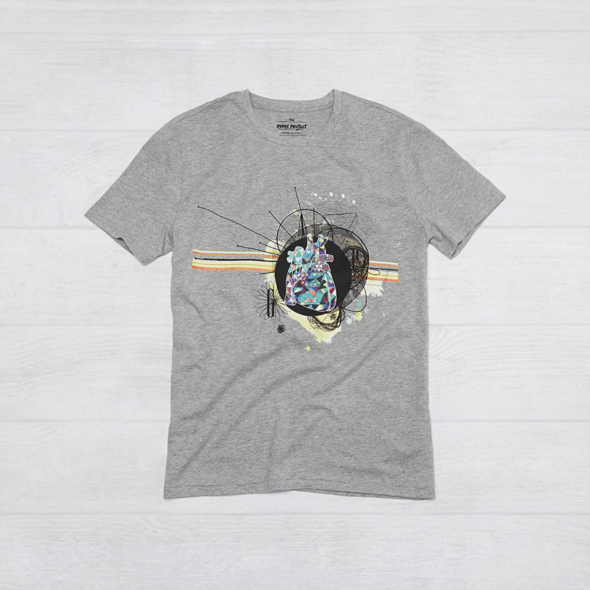
REMIX Project
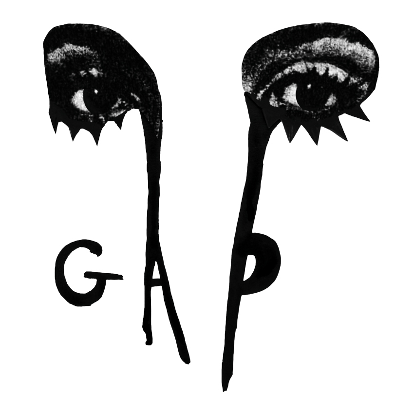
Client – GAP
Senior Producer for Shooting in Japan & Project Manager – Syvian
In 1969, a small store opened in San Francisco selling jeans and records to a new generation. Since then, Gap has grown to be a favorite around the world, establishing its place in pop culture with casual, cool clothing and iconic creative work.
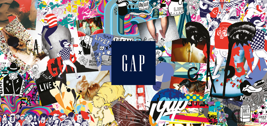
Gap has always stood for self-expression and embracing one’s individual style. Today, Gap continues to support the shared spirit of creativity and encouraging the genuine exchange of ideas. By bringing artists from all corners of the world together in the REMIX Project, Gap celebrates them for their passions and continues its heritage in creativity.
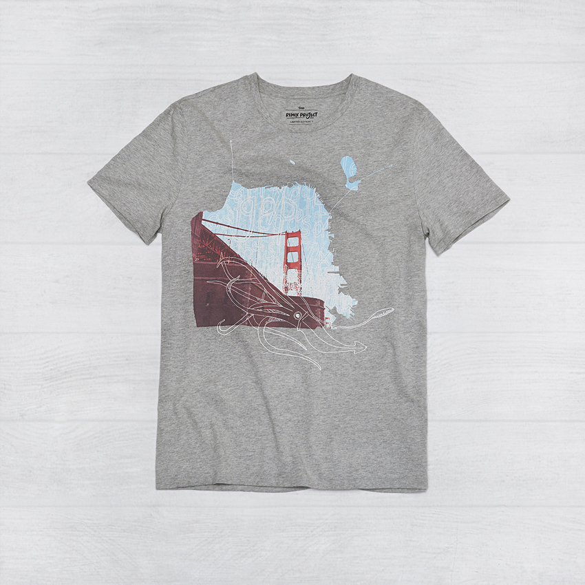
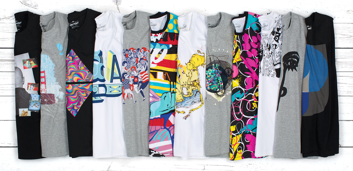
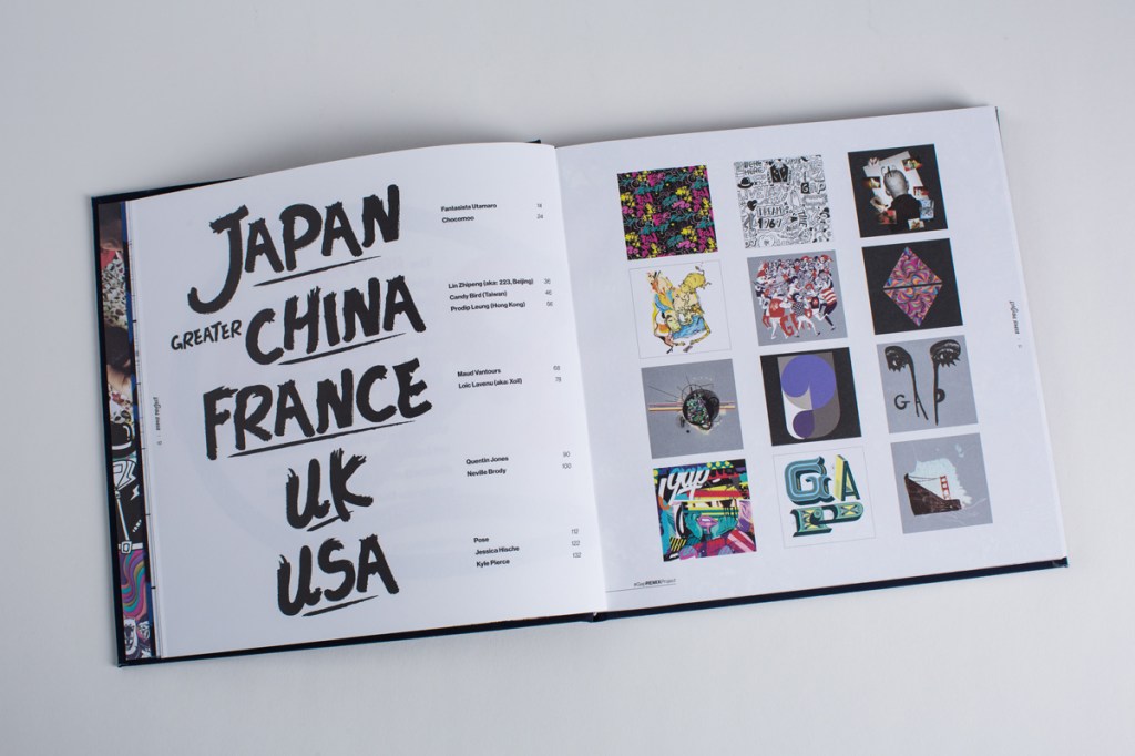
The REMIX Project brings together 12 leading-edge American, British, French, Chinese, and Japanese artists to create an exclusive collection of limited edition graphic tees. Artwork in the collection remixes the classic Gap logo T-shirt into bold art treatments that showcase the distinctive style of each artist and celebrate the creative heritage of Gap.
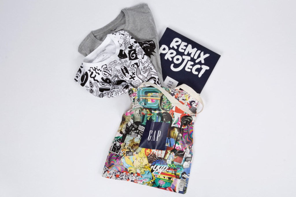
REMIX Project Collection
REMIX Project Book

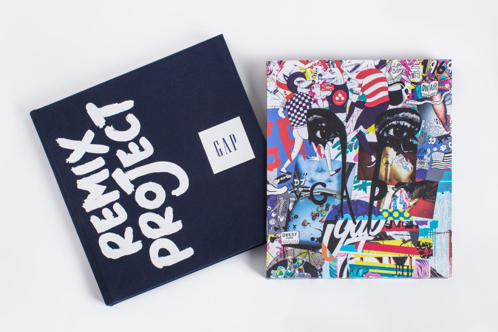

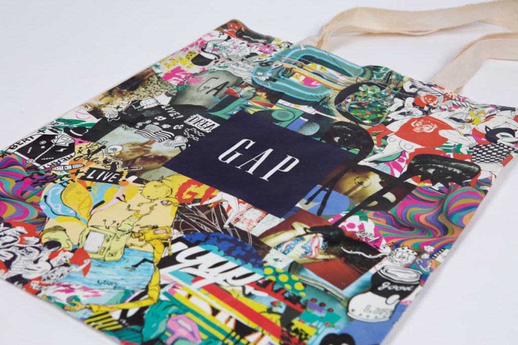
REMIX Project Tote
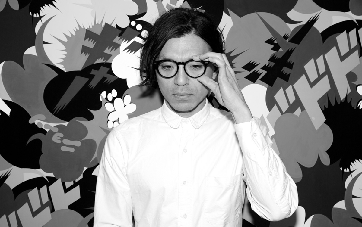
Fantasista Utamaro – Japan
Fantasista Utamaro is a leading manga and multi-medium artist. Known for ultra pop and technicolor sensibilities, his instantly recognizable work spans the fields of illustration, animation, graphic / textile / fashion design, and even outdoor landscaping. His design for the REMIX Project hides the brand logotype within traditional Japanese “Karakusa” patterns, pop art coloring, and manga-styled characters. The piece represents hope for the development of cultures around the world.
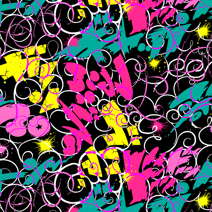
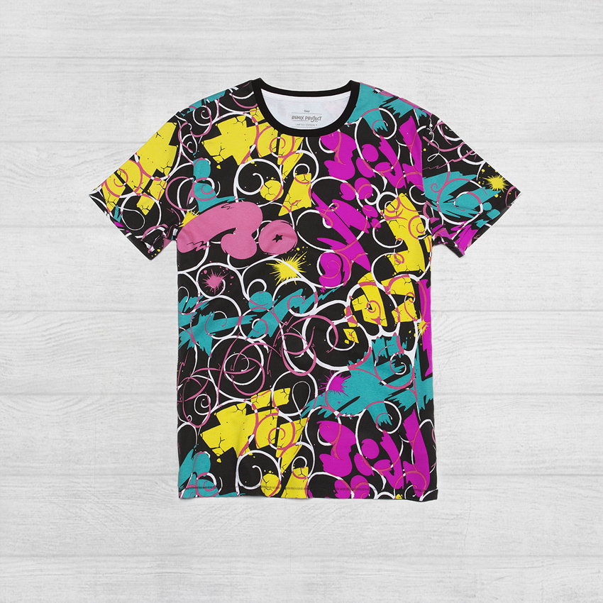
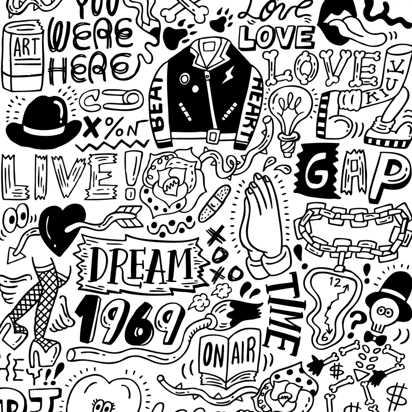
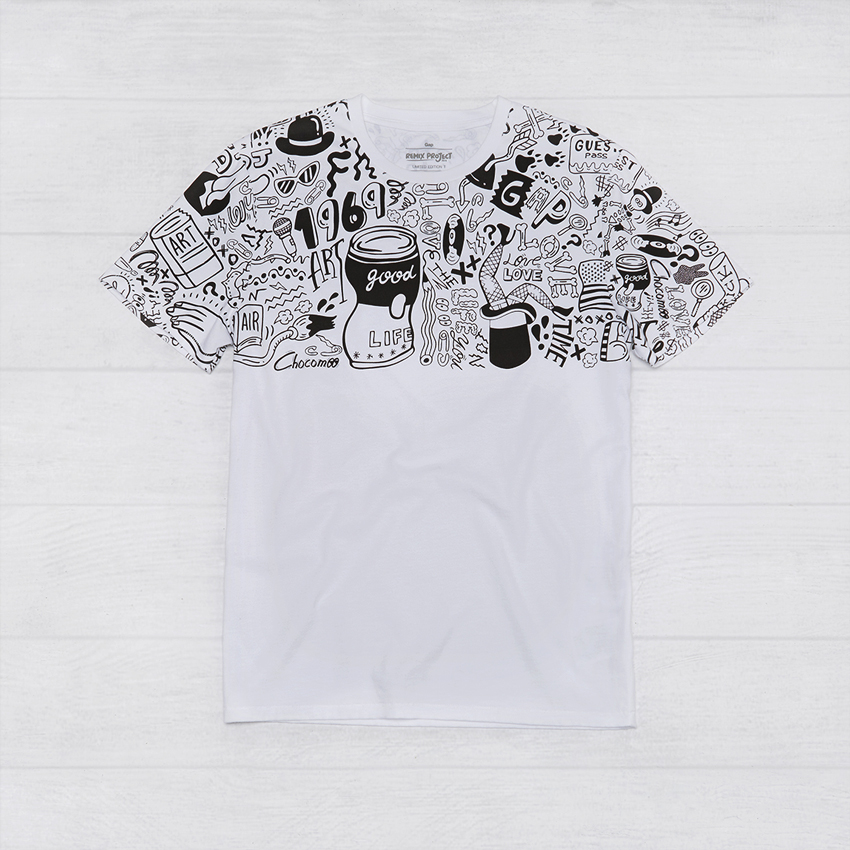
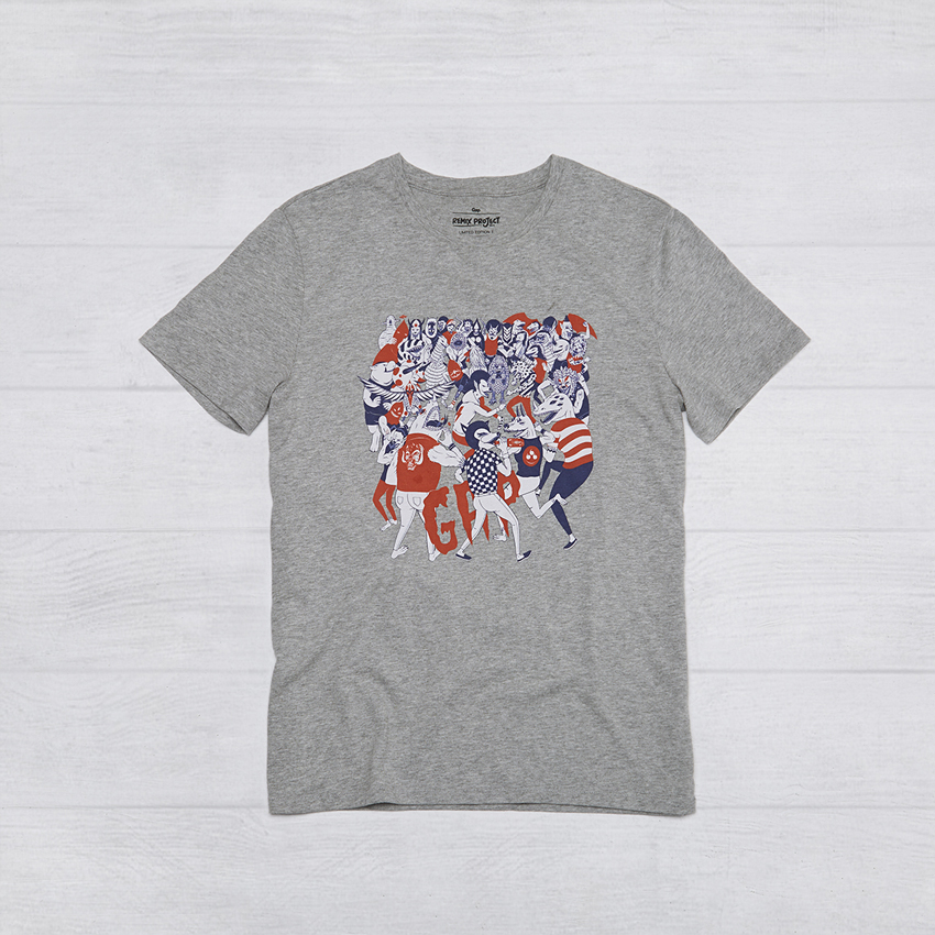
Chocomoo – Japan
Chocomoo is a street fashion illustrator and artist. Influenced by rock music, hip-hop, and traditional Japanese calligraphy, her work is always done in a signature black and white line-art style. Her design for the REMIX Project reimagines the brand logotype among iconic Americana imagery and the things that make me smile: music, fashion, partying, and the sharing of positive vibes with one another.

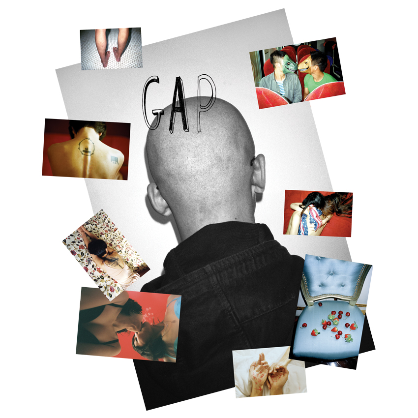
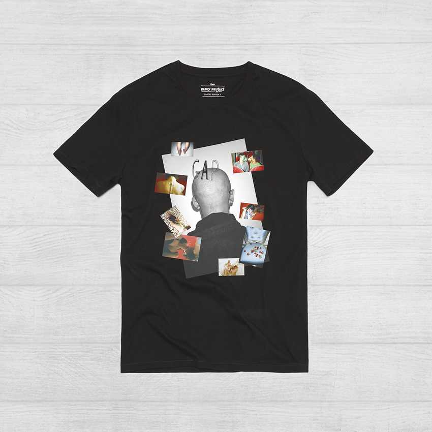
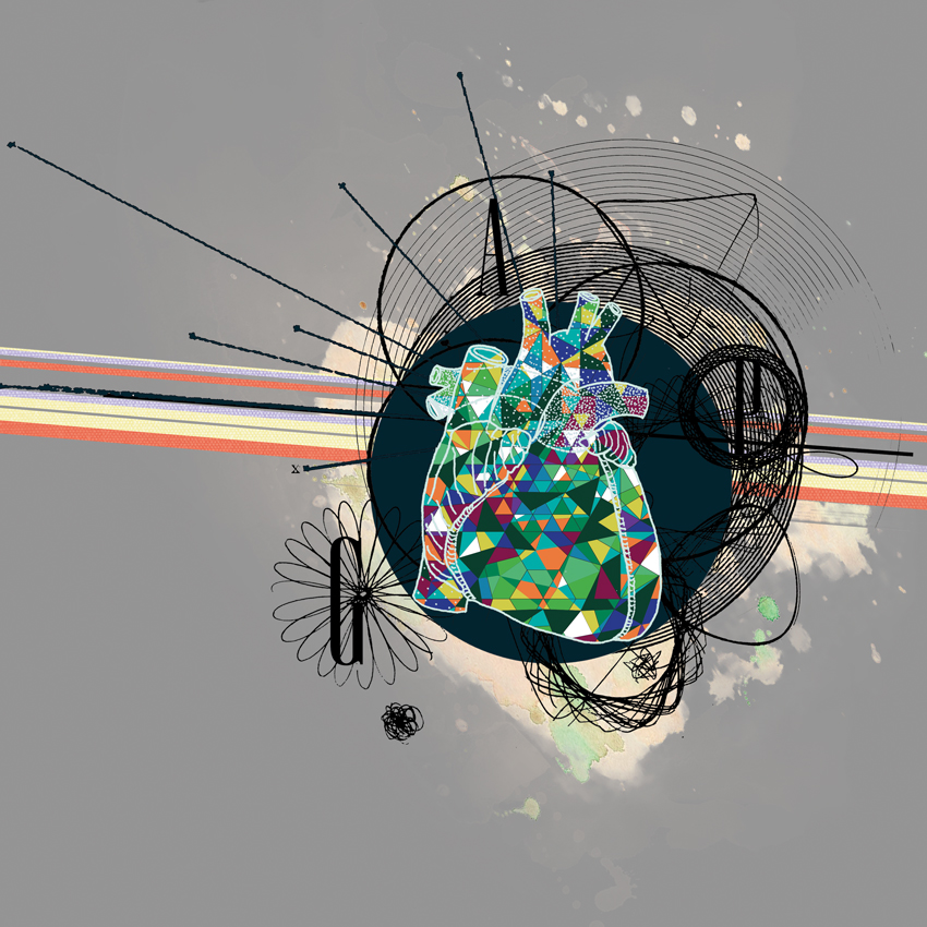
Lin Zhipeng (aka: No. 223) – China
Lin Zhipeng (aka: No. 223) is a photographer known for his ability to show the volatile, primal energy of China’s younger generation. His work explores topics of love, sexuality, gender, free expression, and consumption within the context of modern China. His design for the REMIX Project presents the brand’s logotype amidst some of my favorite recent images to form a snapshot collage of daily life in contemporary China.

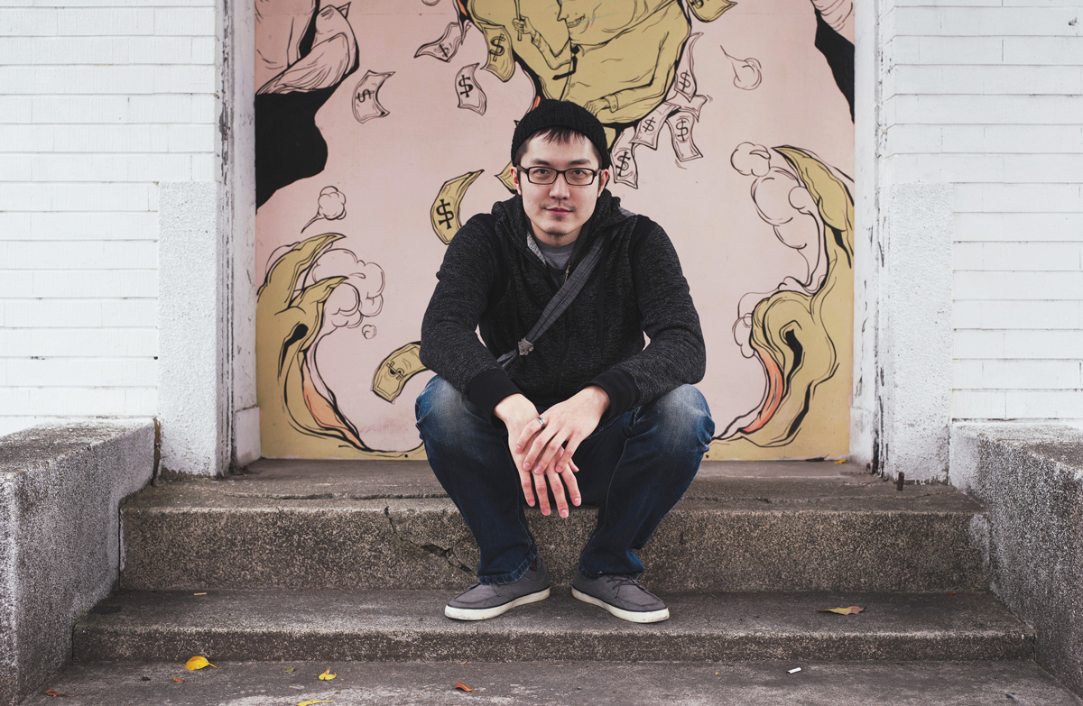
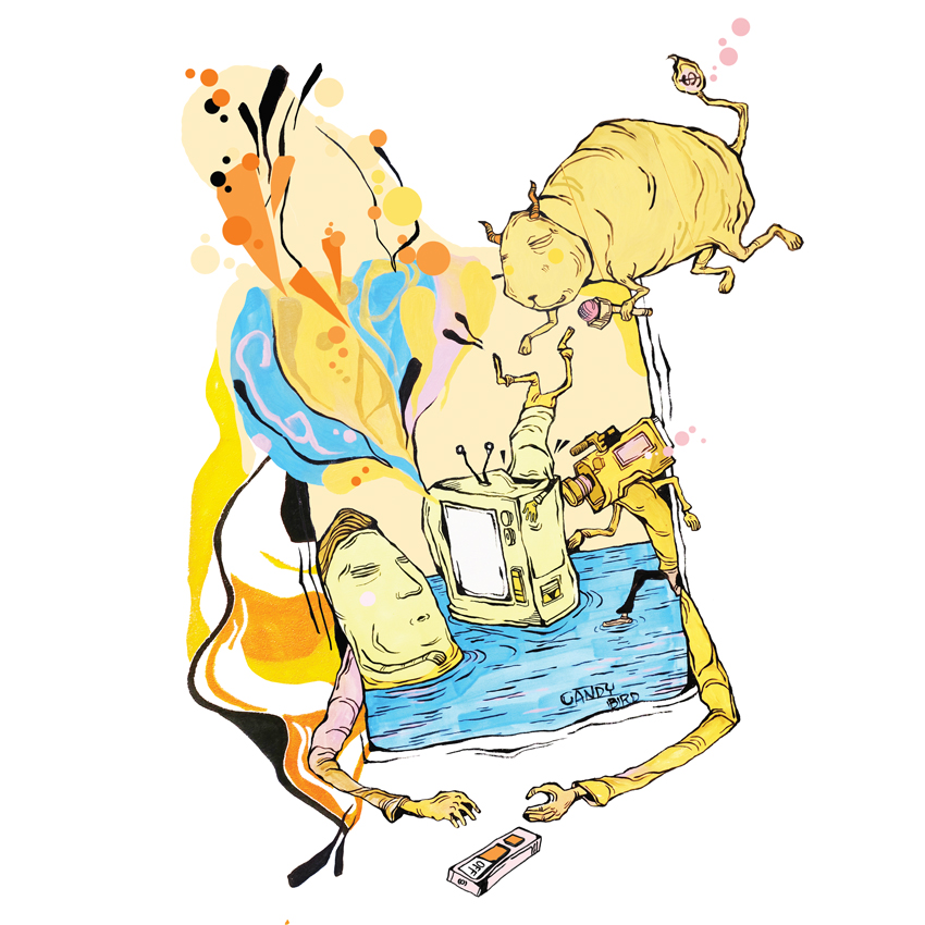
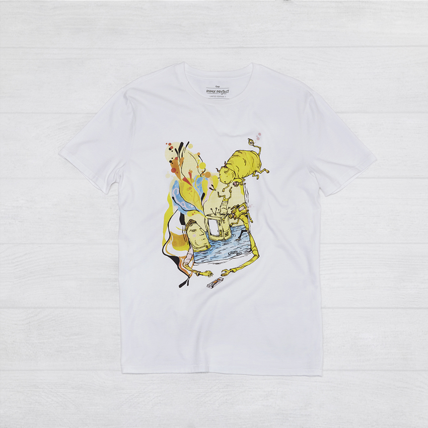
Candy Bird – Taiwan
Candy Bird is a renowned street artist and illustrator who creates unique and playful visuals addressing social injustices and environmental concerns around the world. His design for the REMIX Project incorporates the brand’s logotype into a satirical composition that serves as a reminder for us to curb our obsessions with media and celebrity culture.
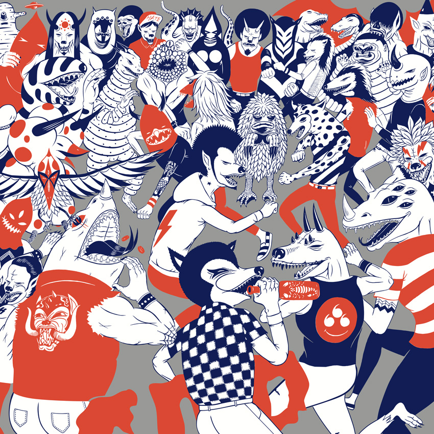
Prodip Leung – Hong Kong
Prodip Leung is a painter, illustrator, graphic designer, and the bassist for the legendary Cantonese hip-hop group, LMF. Combining music with experimental art, his work draws from the legacies of street art, cartoons, and pop culture. His design for the REMIX Project presents the brand logotype amidst a spin-off of my “Monster Pit” print series, with its retro-fashioned, “slamdancing” creatures of the night.

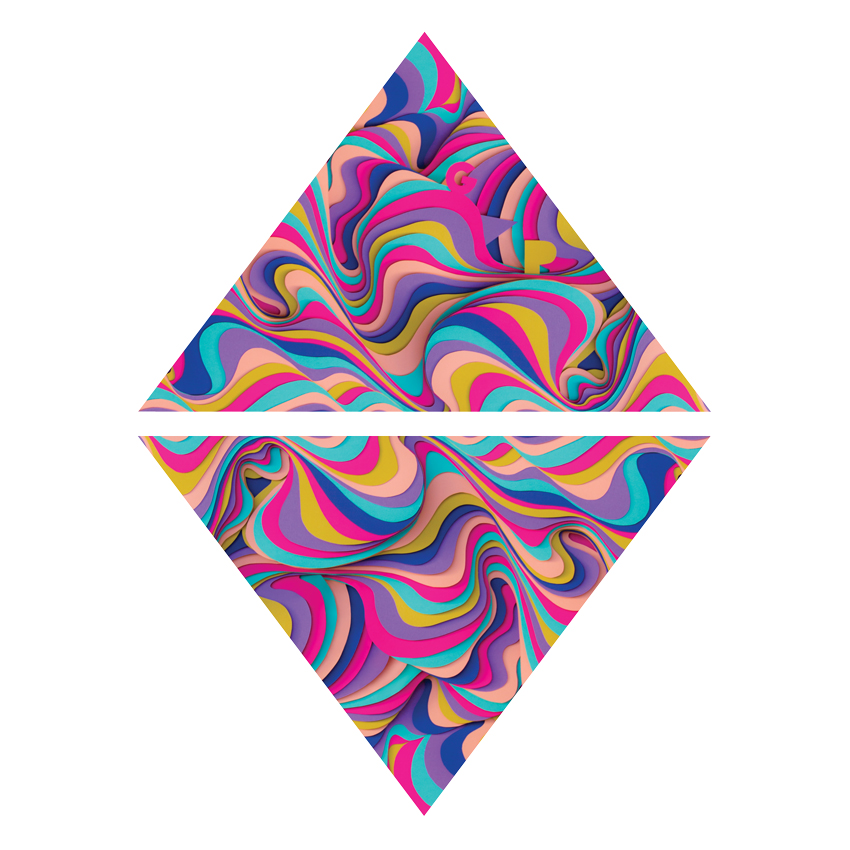
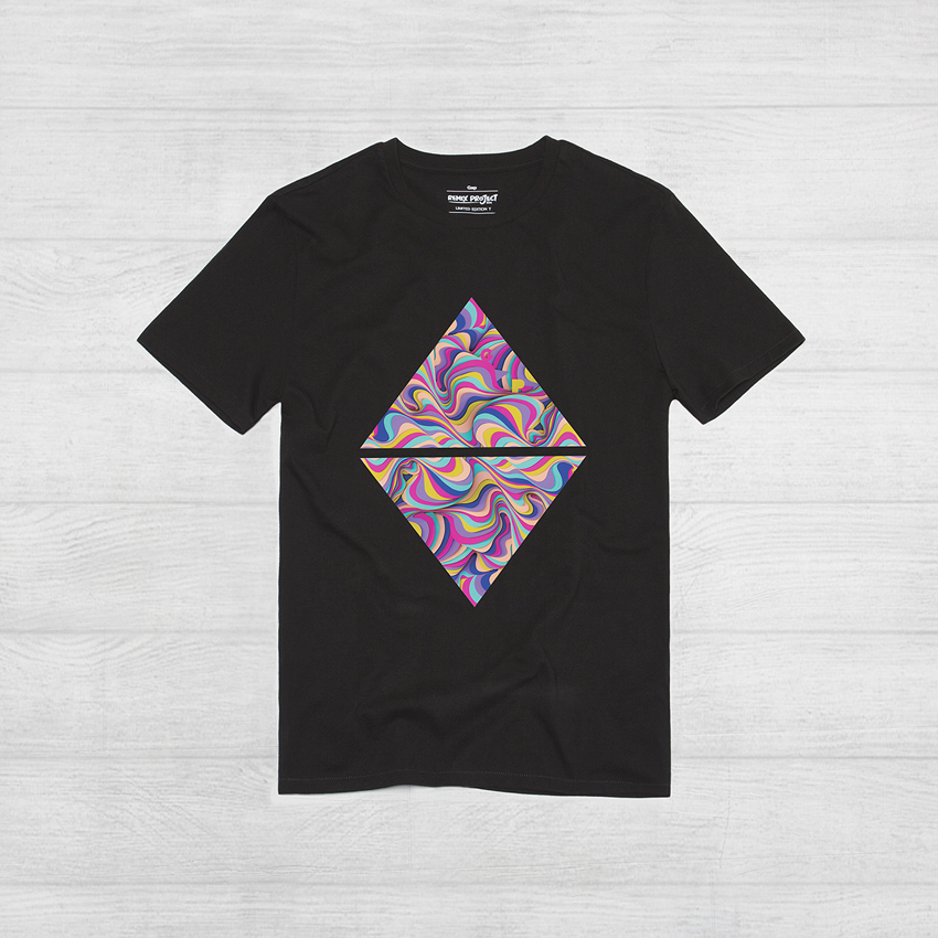
Maud Vantours – France
Maud Vantours is a designer and artist who works with layered, cut, and folded paper to create colorful 3D sculptures of hypnotizing patterns and textures. Her design for the REMIX Project is inspired by nature and dreamscapes. She reimagined the brand logotype within a multicolored and multilayered paper sculpture design that mimics the patterns of waves, mountains, and wind-blown clouds.
Loïc Lavenu (aka: Xoil) – France
Loïc Lavenu is a world-renowned designer and tattoo artist acclaimed for pioneering an abstract graphic style of tattooing. His work pushes tattoo aesthetics into new realms inspired by digital illustration, photography, and collage. His design for the REMIX Project positions the brand logotype within a collaged and transitional reflection of the things that inspire him: geometry, colors, lines, movement, and life’s circadian rhythms.

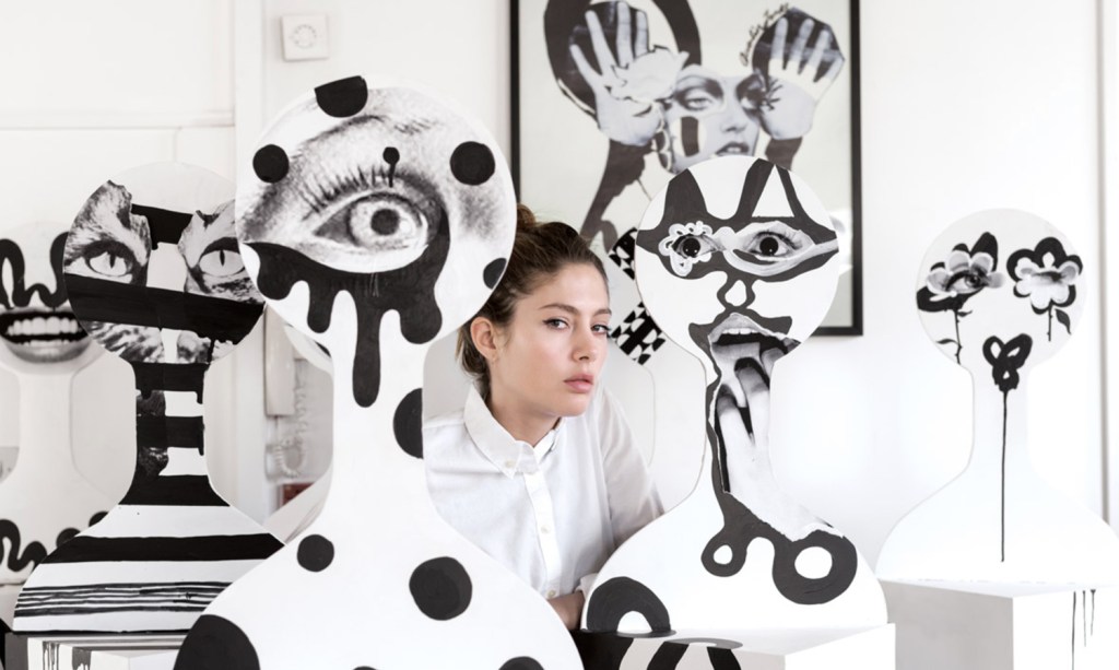
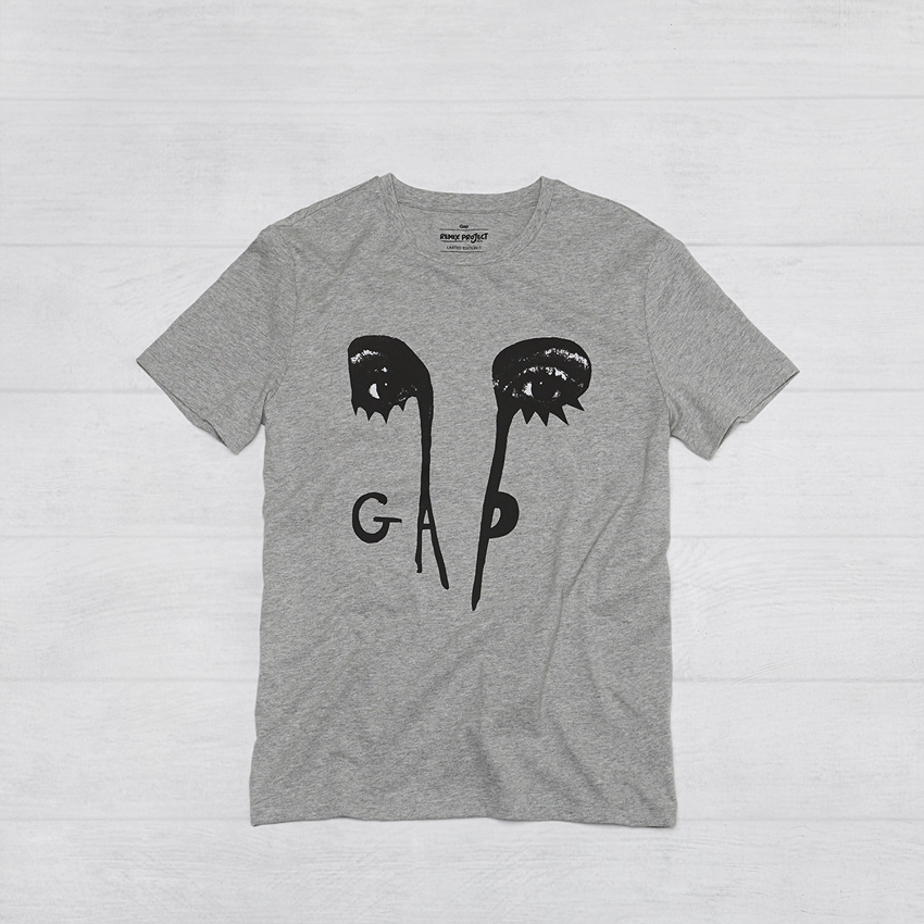
Quentin Jones – UK
Quentin Jones is an artist, filmmaker and photographer. Her aesthetic is a modern take on the surrealist tradition, realized largely through photomontage and loose paintwork. Her design for the REMIX Project is inspired by fashion iconography, and combines the brand’s logotype with simple but impactful collage and brush-work elements to create an ambiguous form composed of eyes, legs and letters.
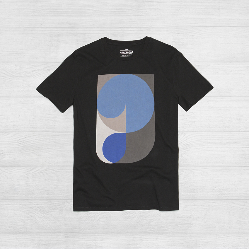
Neville Brody – UK
Neville Brody is a pioneer in the fields of graphic design, art direction, and digital typography. With a career spanning four decades, he is widely acclaimed for his iconic typeface designs. His design for the REMIX Project reinterprets the Gap letterforms using fluid lines and spaces that create an infinite gridded loop where cultural life pools take place and grow.

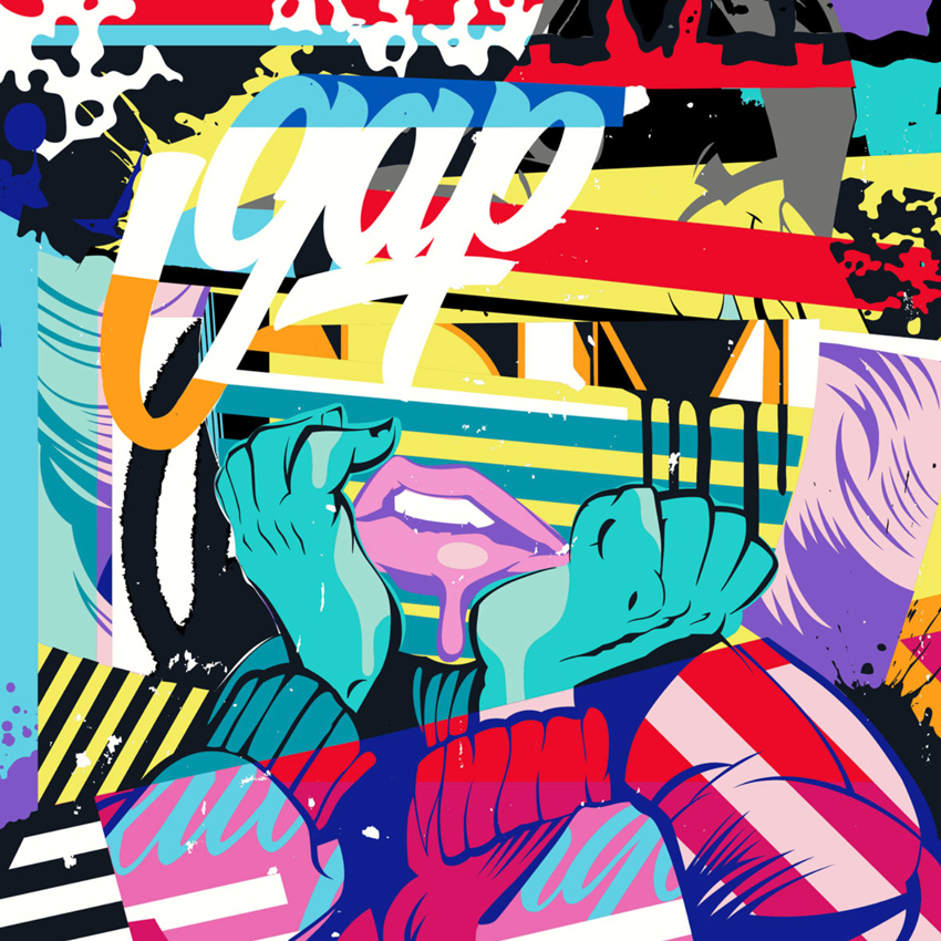
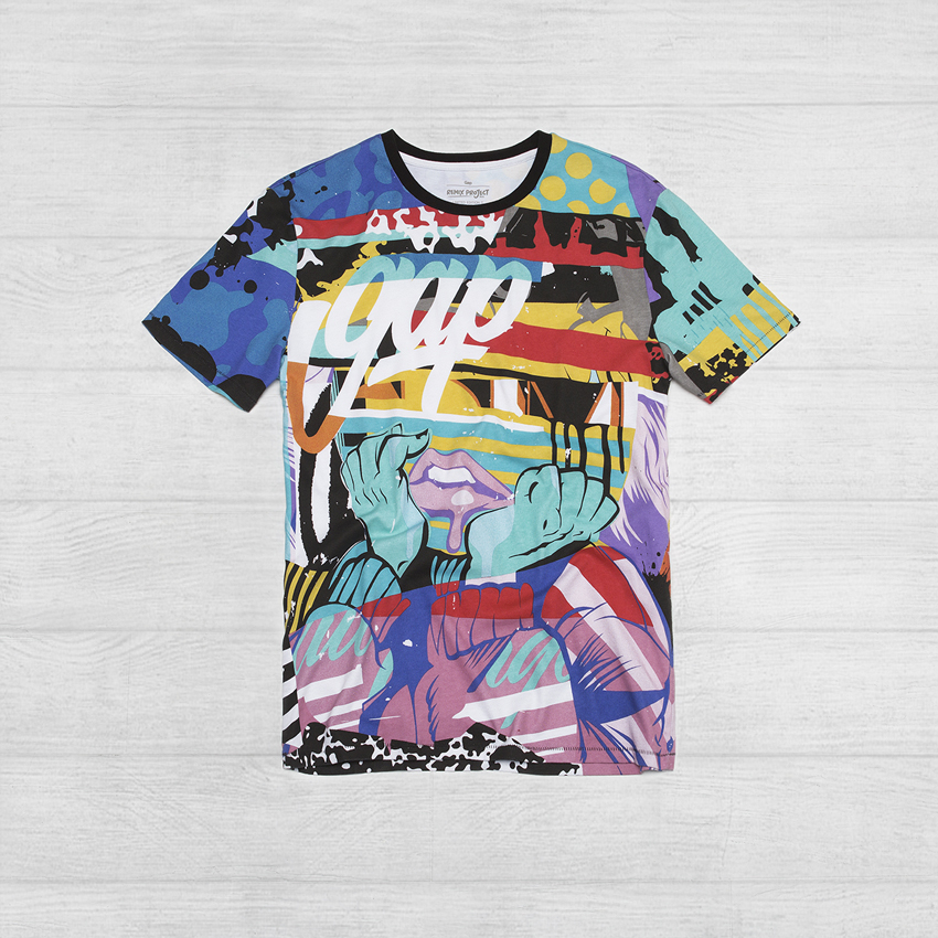
POSE – USA
POSE uses bright colors and tight graphic stylings to create images that jump off walls. Inspired largely by the tradition of pop art, his work integrates illustration, lettering, screen print aesthetics, humor, and even violence. His design for the REMIX Project reimagines the brand logotype within a contemporary portrait. The composition conveys modern expression and human experience as they are: constantly in flux, complex, and affected by environment and everyday experience.
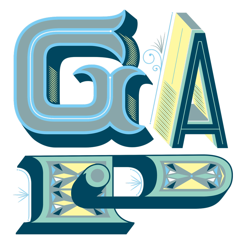
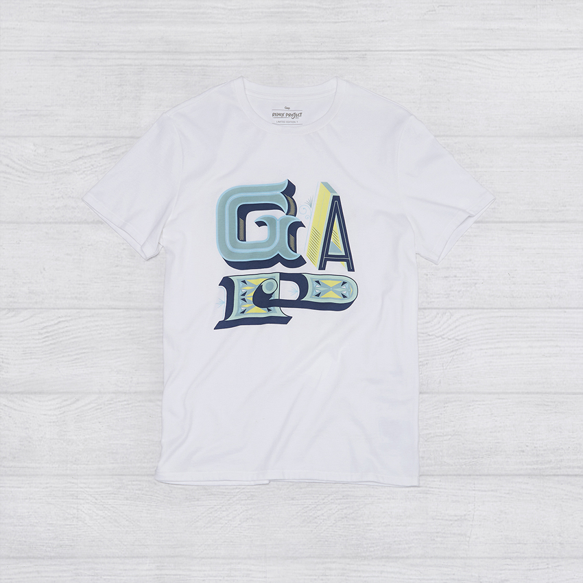
Jessica Hische – USA
Jessica Hische is a letterer, illustrator, and crazy cat lady known for her silly side projects and occasional foul mouth. Her design for the REMIX Project uses vintage-inspired typography made modern though context and color. Mixing historical letterforms with modern graphic geometric decoration, she reinterpret the Gap logotype in a sophisticated and unexpected blue, teal, and yellow color palette.

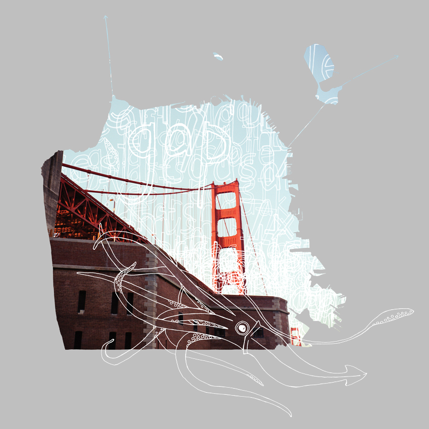
Kyle Pierce – USA
Kyle Pierce is an illustrator and photographer who enjoys building layered narratives from photographs, illustrations, and bits of simple hand-drawn type. His design for the REMIX Project is inspired by San Francisco, the city I live in and where Gap was founded in 1969.
His design presents the Golden Gate Bridge within a contour of the city borders, while letterforms and the brand logotype recreate the fog that so frequently graces “The Gate.”